NEW WEBSITE WOO-HOOO!
Words can hardly describe my excitement over this most recent site design. You know when you work on something for a long time, and then finally get to live in it, enjoy it, and show it to other people? Well, you know. It feels pretty good.
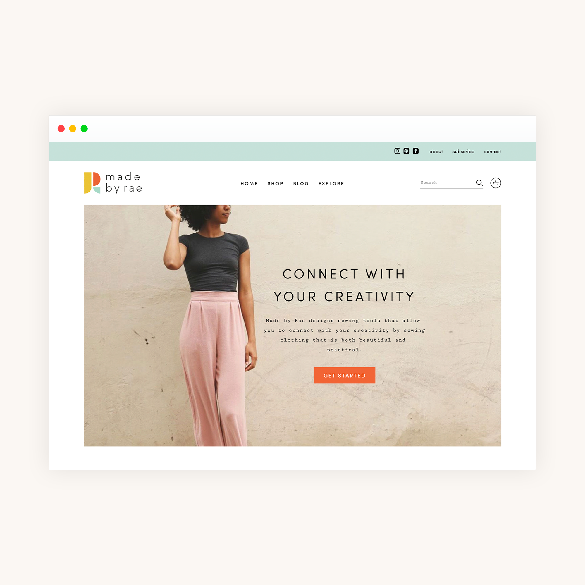
If you get my posts via email or use a blog reader, you might not notice that the site got a pretty major facelift last week, so I invite you take a moment to click over and look around if you have a chance. You’ll find all of the same basic elements: a blog, a shop, a tutorial page, pattern info pages, an about page…but most the broken stuff is now gone (shaking my fist at you, “latest blog post” section that stopped working two years into my last site design), and now the site even — wait for it — FULLY WORKS ON A PHONE! That’s right, folks: no more zooming in and out to read tiny words. I can tell you all are almost as excited about that as I am.
I also added an “Explore” page which is a bit of an overview of the site where you can start if you’re new, and if you’re really interested in digging deep, the Archives page is for you.
There are still some things here and there that I still need to fix (and due to a platform change for the blog, a lot of the old posts got squished and lost their line breaks and formatting but when you have 1000+ posts, well, you just decide that some things aren’t super urgent) but overall things should be working quite nicely.
The new site is the culmination of a now multi-year-long project that began with hiring Kristin and Lindsay of Four Oh Seven to do rebranding work for Made by Rae in 2017 — they produced the colors, fonts, and beautiful new logo (it’s hard to condense a branding project into one sentence — that will have to suffice for now) that replaced the old “trio of shirts” logo I had been using since 2010. I’ve been incorporating the new branding into graphics, pattern covers, digital pattern files, postcards, etc. since that project finished last year, and I was so excited to apply the branding elements to my website. Kristin and Lindsay did a fantastic job — I absolutely love the work they did.
I then worked with Fianna of Form + Flourish for the second phase of the project, which was to take the branding elements and incorporate them into a new website design (I had known from the very start that I would be doing this in two phases - a branding phase and a web redesign phase). I wanted the site to be more mobile-friendly and also wanted to take the blog off of Wordpress for good (I’ve had the shop on Shopify since 2014, but the blog has been running on Wordpress since 2011). Self-hosting is not for me for a number of reasons, and I decided to move my blog posts onto Squarespace, having been brainwashed for years by the constant bombardment of Squarespace ads on This American Life. Fianna was amazing, and I’m so pleased with how everything turned out.
Fianna managed to design two sites that are exactly what I wanted - colorful but not too busy, clean and modern but still fun — and made them look identical to each other so you barely notice there are even two sites at all. She then proceeded to move close to a bajillion old blog posts onto one of them without either of us having a mental breakdown, which is possibly the bigger feat.
Anyway. I love it and I’m so happy it’s up and running! I hope that you’ll find the new site fun and easy to use and that it will be a resource for many a future sewing project and sewist!


