New WEBSITE, y'all!
There is a reason that we bloggers tend to blather on about new websites. They either took a great deal of time or a great deal of money to put together, so we want to make sure that EVERYONE. KNOWS. ABOUT. IT. There is a desperate hope that at the very least, loyal readers will leave the safety and comfort of their Blog Readers just once to come over and take a look and give us a big chubby pat on the back for all that effort.I've seen people who hit the ground running with zero readers and a fancy website, all ready to go. This blog started out in such a humble way it never even crossed my mind to use anything other than Blogger. It seemed the thing to do, to join in on the sewing groundswell. Blogger is fantastic for basic blogging, but then I wanted three columns. And then I wanted side pages. And then I wanted a nav bar across the top. I found myself hacking the code *snorts rootbeer out nose at how tech-snobbish that sounds* more times than I wanted to. Which wasn't so much "hacking" as it was whining at Mr Rae for help with basic HTML (me: "Babe, how do I do the HTML for a link again?" Mr Rae: *pounding head against wall*). The point is, this site needed a major upgrade. And if our marriage was going to survive, that would require outside help. I won't go through the gory details of the process, because the embarrassing fact is that I began this new-website-project nearly a year ago and it didn't go exactly as I'd planned and really wasn't very fun. The important thing is, it's finished now. More or less.So now I'll stop blathering on and show you a few of the things I like best, so maybe you'll come on over and say you like it. One of my favorite things about the new layout is that the patterns and tutorials have their own pages now (def: "pattern" - something you print out a template for, def: "tutorial"- a set of instructions and/or pictures to help you make something) on their own pages. Here's the pattern page:
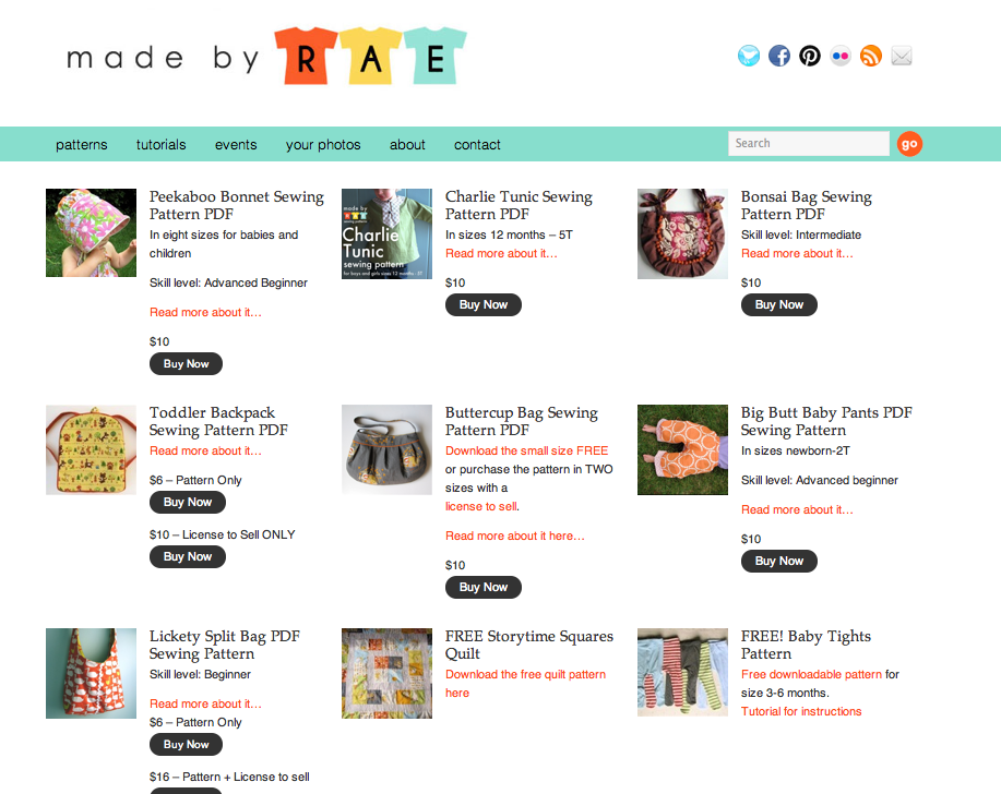
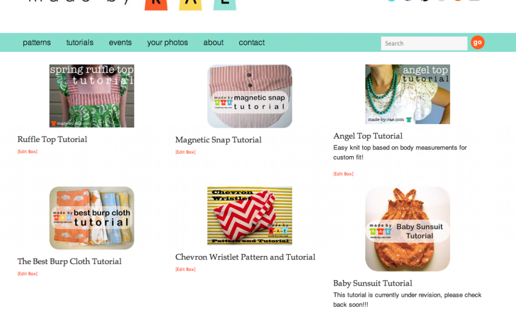
And here's a peek at the tutorial page:
All of the photo pools for my site or patterns are finally (!) all in one place. You can find them by clicking on the "your photos" link at the top of the page.
There's more cool stuff, but I'll save the rest of the "tour" for later I guess because yikes it's late and I need to go to bed. In addition to looking downright foxy, I am really hoping the new website gizmos will be useful to those of you who have spent time looking for things like tutorials or photo pools and found the old site lacking. I'm still hoping to condense the post labels a little bit, but does anyone even use those anymore? And there's a cool scrolly thing at the bottom of the page that needs a few more pictures in it, so I'll fill that up with fun things to click on. Maybe if you think of other things you would use or appreciate, you could drop me a line and let me know. There's a "contact" link at the top of the page now so you can do that with ease. Yaaaay! Major excitement over here, my friends. Major excitement.PS. I know it's redonkulous and crazy to do a new website launch right after we just moved to a new house. What can I say? My website got jealous and wanted to move too.


